Many companies are in the process of developing executive dashboards, cockpits, consoles, portals or whatever you want to call them. To what degree have these been designed to be most effective? Designer Edward Tufte has addressed these issues in a number of 'ask ET' pieces at his web site. Worth a look, these discussions provide a number of designs and discussions by designers.
" ...Can you share any guiding principals or "best practices" in the presentation of Key Performance Indicators to the senior executives of a corporation? Discussion.
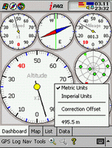
Executive Dashboard
I'm developing an executive dashboard, and I haven't been satisfied with the business graphics that are widely available (e.g. gauges, dials, stoplights). I decided to make a "Zen" version of a KPI status indicator, using as little color as possible, and incorporating E.T's innovative "Spark Line" metaphor for display of trends. The graphic below shows the proposed KPI display across the top of a browser screen with a descriptive example in the middle. Any feedback would be wonderful!
Discussion..."
No comments:
Post a Comment